CRATOD é premiado no III Prêmio Experiências Exitosas – CSS
31 de janeiro de 20179min3438
* Por Adriana Moraes
É sempre agradável falar de programas que mudam para melhor a vida das pessoas e também é muito prazeroso ver os resultados! O Centro de Referência de Álcool, Tabaco e outras Drogas (CRATOD), sob a direção do psiquiatra Dr. Marcelo Ribeiro foi premiado em 03 categorias no III Prêmio Experiências Exitosas – CSS.
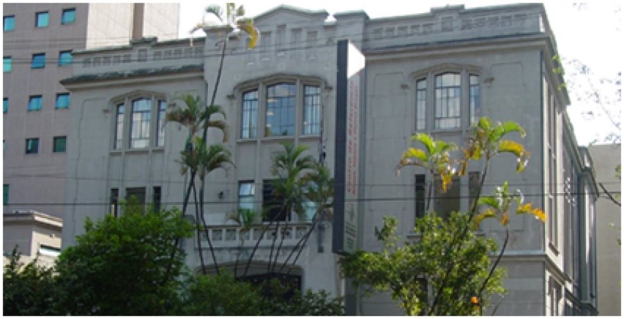
O CRATOD é um Centro de Referência, para a definição de políticas públicas para promoção de saúde, prevenção e tratamento dos transtornos decorrentes do uso indevido de substâncias psicoativas, dispondo de CAPS AD III (Centro de Atenção Psicossocial Álcool e Drogas) para atendimento aos usuários dependentes e suas famílias, bem como o responsável pela organização, capacitação e manutenção das Redes de Tratamento do Tabagismo e Rede Recomeço no estado de São Paulo. [1]
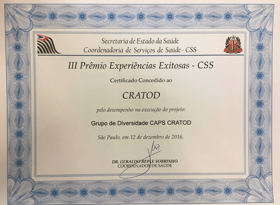
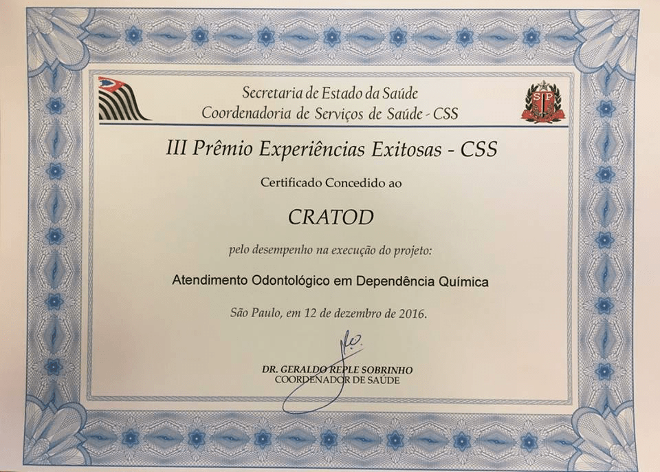
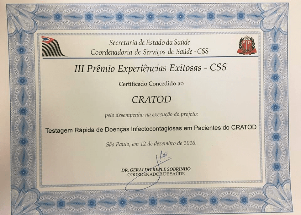
O III Prêmio Experiências Exitosas – CSS foi concedido ao CRATOD pela Secretaria de Estado da Saúde – Coordenadora de Serviços de Saúde – CSS pelo desempenho na execução dos seguintes projetos:
Grupo de Diversidade CAPS CRATOD
Atendimento Odontológico em Dependência Química
Testagem Rápida de Doenças Infectocontagiosas em Pacientes do CRATOD
** Dr. Marcelo Ribeiro
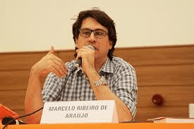
Psiquiatra respeitado no meio científico e acadêmico, Dr. Marcelo Ribeiro é um exemplo de médico dedicado. Há anos pesquisa o crack e ao lado do renomado psiquiatra Dr. Ronaldo Laranjeira, publicou o livro “O Tratamento do Usuário de Crack”, uma obra que se tornou referência no assunto. [2]
Parabenizamos Dr. Marcelo Ribeiro e todos da sua equipe especializada na área da dependência química, por toda dedicação ao trabalho e pelos resultados obtidos!
*Adriana Moraes – Psicóloga da SPDM (Associação Paulista para o Desenvolvimento da Medicina) – Especialista em Dependência Química – Colaboradora do site da UNIAD (Unidade de Pesquisa em Álcool e Drogas).
**Dr. Marcelo Ribeiro, médico psiquiatra, Diretor do CRATOD (Centro de Referência de Álcool, Tabaco e outras Drogas), professor afiliado da UNIFESP (Universidade Federal de São Paulo), Diretor de Ensino da UNIAD (Unidade de Pesquisa em Álcool e Drogas), pesquisador do INPAD (Instituto Nacional de Ciência e Tecnologia para Políticas Públicas de Álcool e Outras Drogas).
Referências: